
Thursday 16 December 2010
Monday 13 December 2010


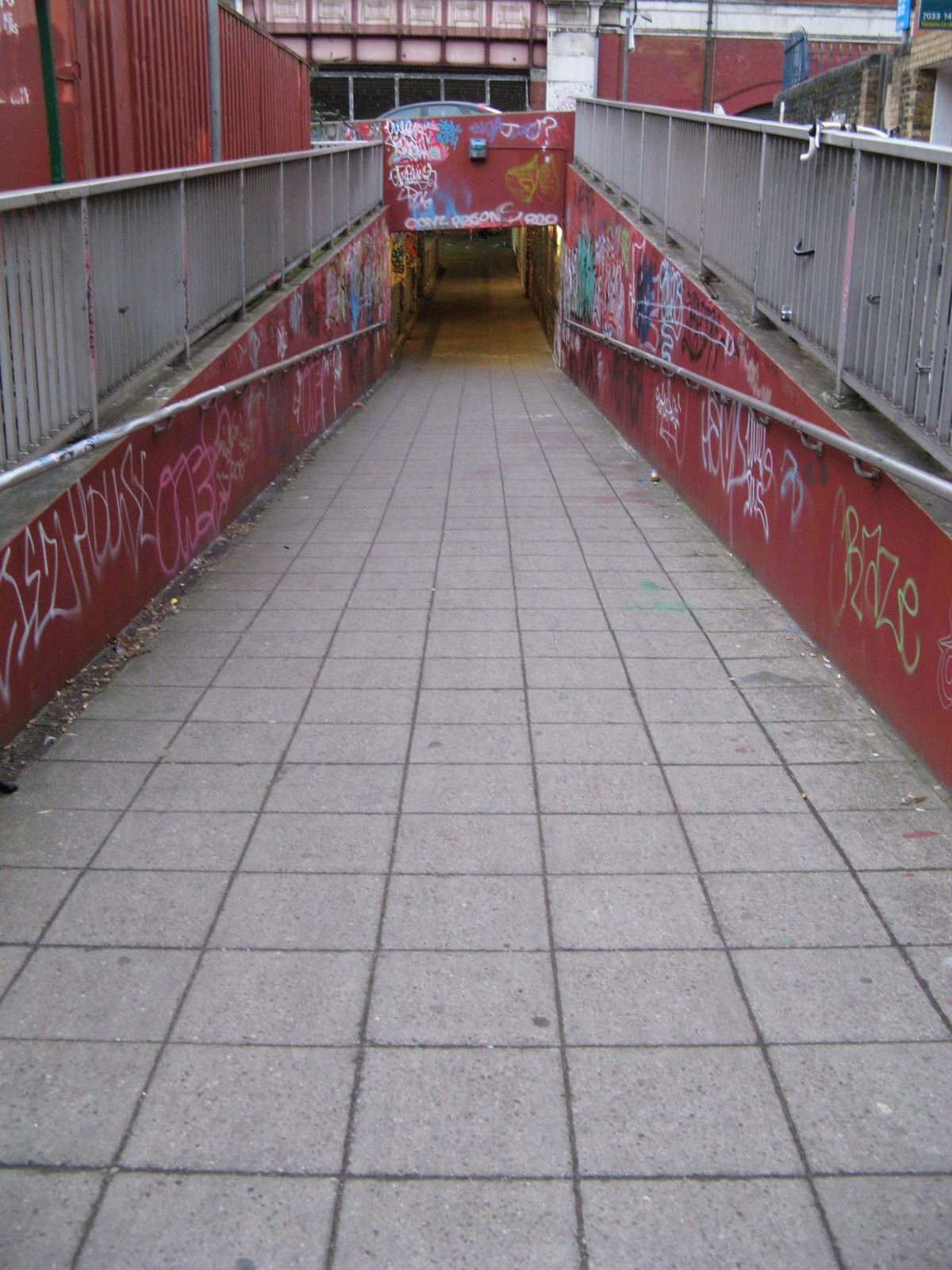


Photos for digipak (planning)


These photos are in my shortlist for my digipak because it relates to our audience and genre. Our genre is dance so I decided to use photos that show dance and movement. The grafitti is very relatable as it is also in our video.

Thursday 9 December 2010
Audience feedback
Wednesday 8 December 2010
Overview of Do's and Dont's of design work (planning)
Do
Use a clear/similiar font type throughout digipak and advertisement which relates to genre
Use clear/appropriate images for your genre
Use same layout
Don't
Stretch images as they will be out of focus
Use unnecessary effects as it might not relate to the genre
Use different fonts that doesnt relate to the genre
Short list of fonts, colours, layout and design
Font - Electro/techno type
Colours - black/yellow/red
Layout and Design
Electric hazard symbol on the front cover which relates to the song title of an electric current as it shows movement and also relates to the genre 'dance'
'Galvanize' - main song title underneath means electric current
Back cover
Image of waterloo/grafitti wall
'Don't hold back' - main song words underneath
Track list '10 song titles' - on the left
Bar code - bottom left
Record Labels/producers - next to barcode
Copyright
Year of production
Writer
Planning of digipak and advertisement


This is my planning page of my digipak and advertisement. I have written all the information I will be including in my digipak and advert. I think it is very important to plan and get all your ideas together before starting to produce the digipak and advert. Planning has helped me alot as I know what to do and also how to make it better.
Subscribe to:
Posts (Atom)